Information Architecture
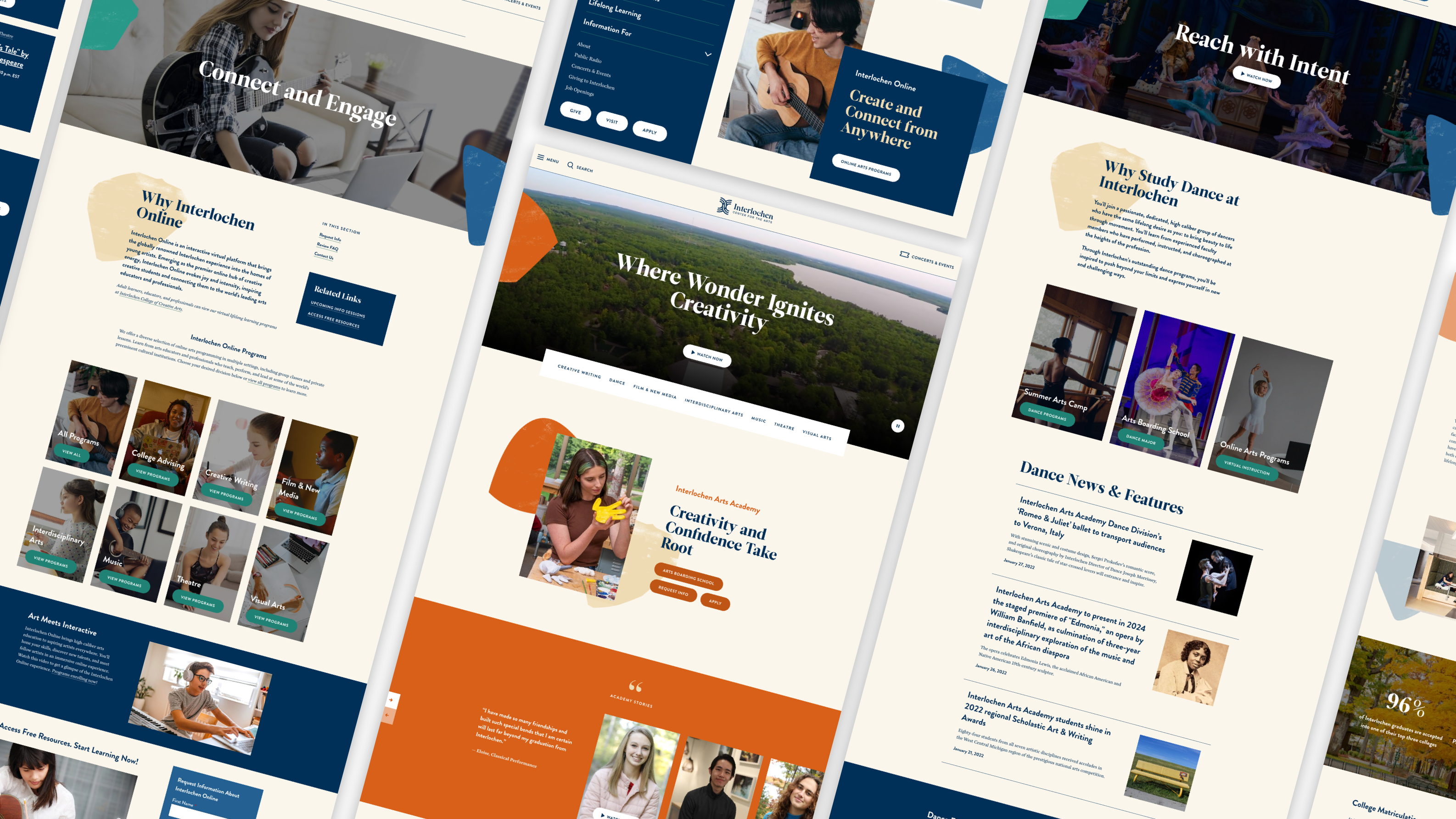
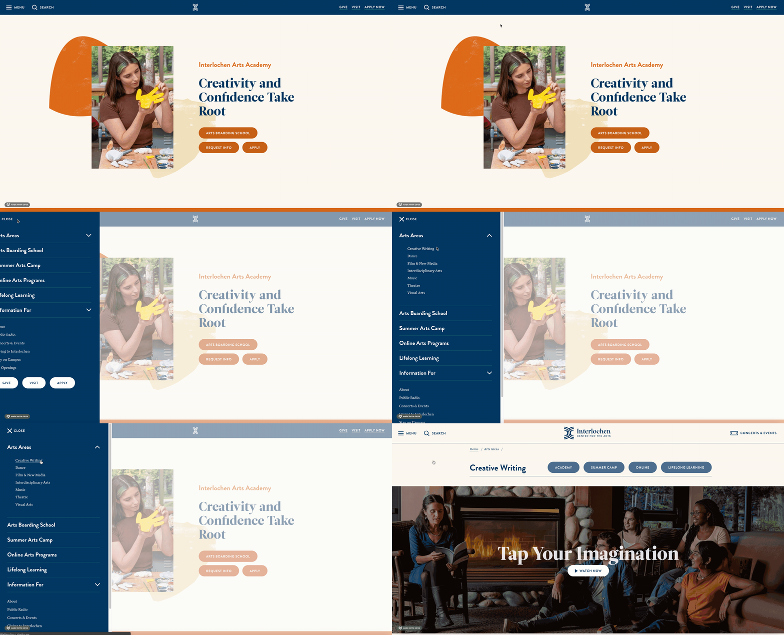
Interlochen’s homepage not only needed to be updated—it needed to be reorganized. Previously, it was easy for visitors to get lost or siloed into a program that did not meet their needs. But the new information architecture anchored to Interlochen’s arts areas rather than its organizational structure. This meant the center could tailor its messaging to visitors based on their area of interest. Visitors could slow down to understand the richness of the arts offerings before they hit a specific program page.
Accessibility
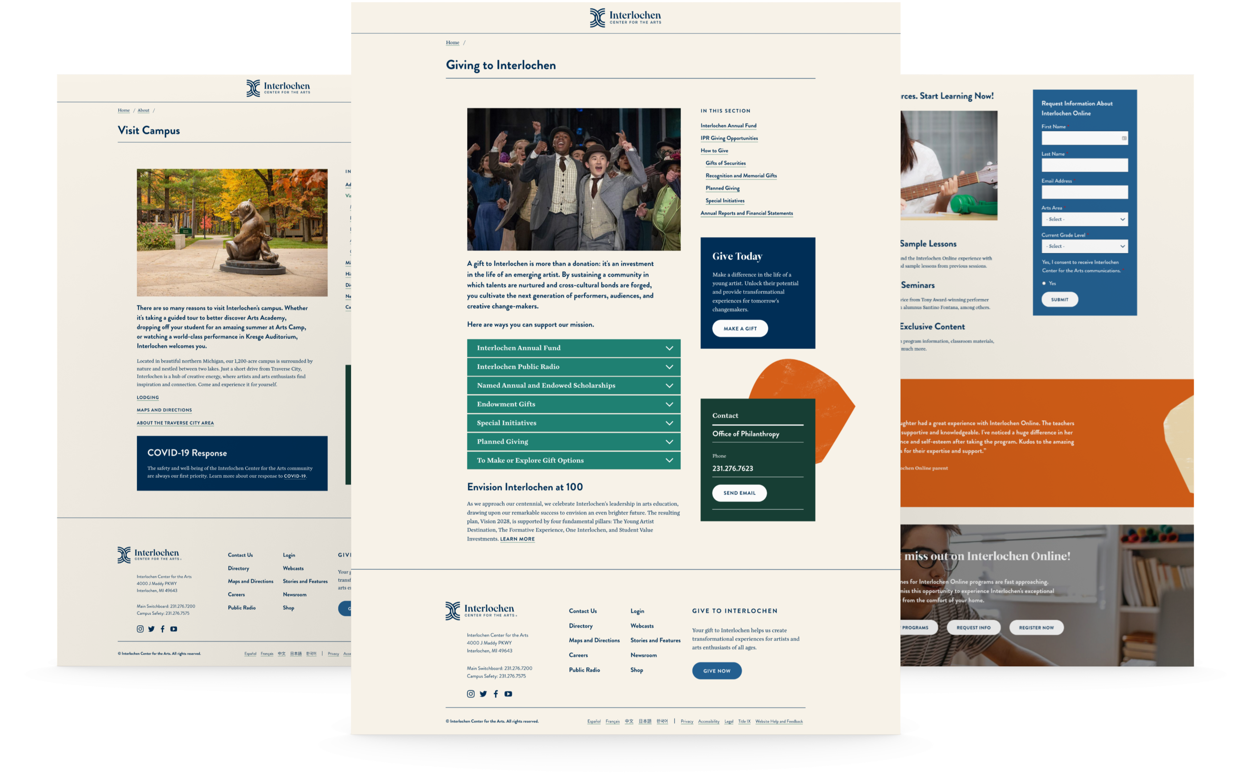
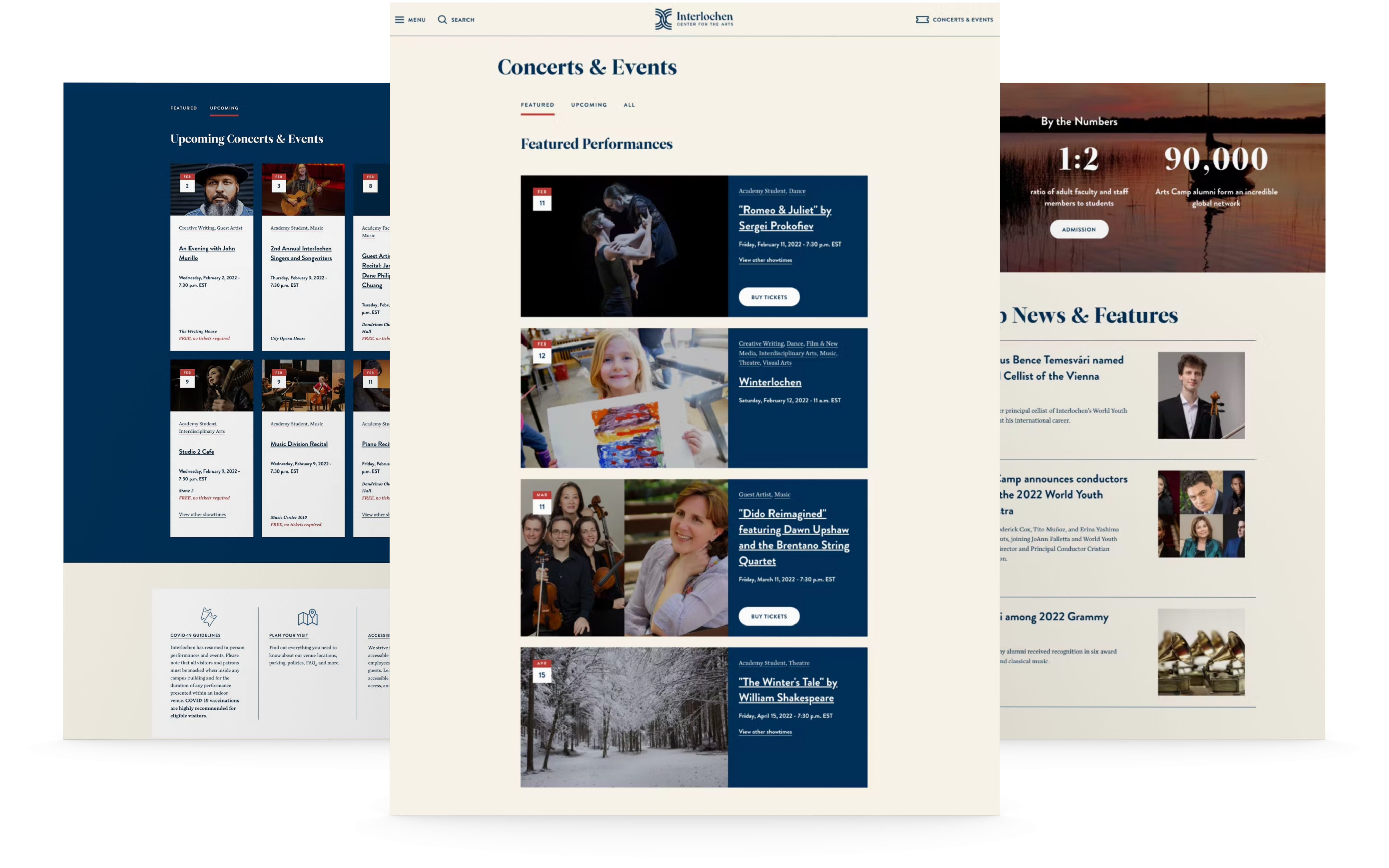
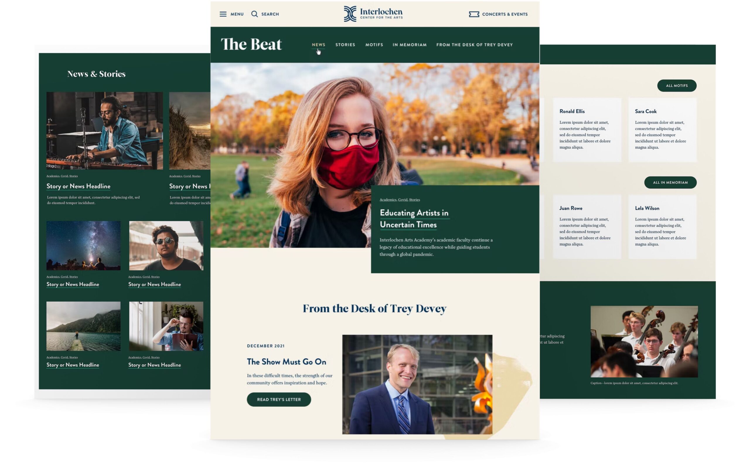
While prospective parents and students needed an upgraded homepage, other visitors to Interlochen’s website needed a refreshed website as well. Concertgoers, benefactors, and alumni also wanted to continue to feel connected to this community that had transformed their lives. So the Carnegie web team worked to ensure the website was accessible and user-friendly for all audiences. We tested typography and created white space so all the information would be very easy to read.
Visual Design
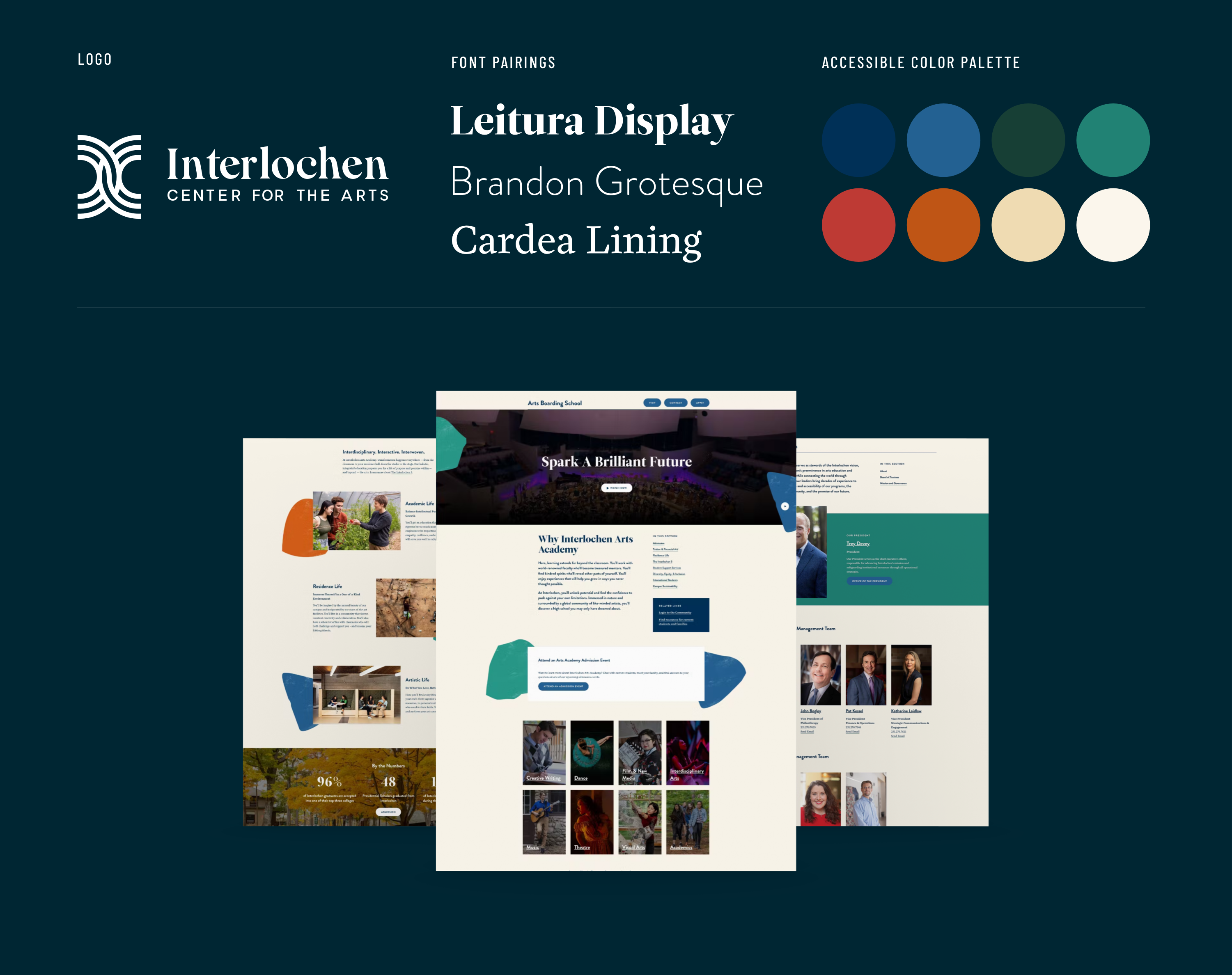
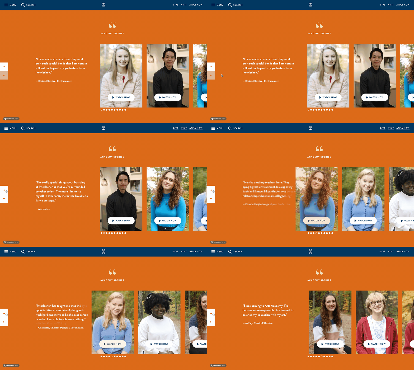
Interlochen had a new brand strategy and vibrant new visual identity. So Carnegie’s web team went to work to showcase the center as a destination for young artists and art lovers. Using Interlochen’s brand guide, they brought youthfulness, playfulness, and creativity to the site. They brought grace notes to every page on the website so each section felt distinctly Interlochen. Using these flourishes and elements of animation, Carnegie’s web team brought the brand to life.
