 Sep 18, 2024
Persona
Sep 18, 2024
Persona
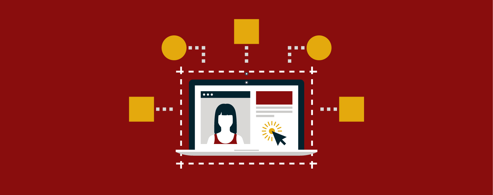
It’s a common refrain when higher ed marketers approach content strategy for their institution’s website – “my priority content can’t require more than three clicks or the user will lose interest.” The three clicks mentality in web design goes back decades and the dogma hasn’t become less powerful with age. In the attention economy, where a TikTok video that doesn’t compel fast enough can be swiped away in an infinite scroll, it feels more urgent than ever to capture site visitor’s attention, and fast.
There’s more to the picture for any user’s journey than an arbitrary magic number of clicks. (Data hasn’t supported the three clicks adage, by the way.) Limiting interaction cost is key in building effective websites, but strictness around clicks can lead to decisions that diminish user experience in other ways.
Site visitors want to feel like they are making progress on your site. Being able to logically move toward a goal will do more to reduce frustration than tamping down on click counts. Before scrapping your existing information architecture, consider implementing usability adjustments to improve your site.
Clear and concise navigation categories
A well-designed website with clear and concise navigation menus can help users find what they’re looking for quickly, regardless of how many clicks it takes from the homepage.
Top-level navigation doesn’t have to do it all. When there are too many top-level categories, site visitors have to process more information and take on a greater cognitive load. Rather than overloading with too many categories, intuitive drop-down submenus will make it easier for site visitors to find what they are looking for.
Resist using link labels for navigation categories that are too steeped in brand voice or insider jargon. Site visitors who are comparing multiple institutions are expecting to see predictable categories and terms. “Academics” is where site visitors expect to find information about majors and minors, for example, rather than something less specific like “Learn” or “Knowledge.”
Right-sizing your web content
Many users visiting a college website have a specific goal in mind, such as applying for admission, finding financial aid information, or looking up course schedules. These users may be willing to click through a few pages to get to the information they need, rather than wading through a cluttered page trying to find it all in one place.
An effort to reduce clicks flattens the information hierarchy, meaning in many cases that pages have to hold more content in order to avoid creating subpages. This can disorient site visitors – when everything is located off the root, breadcrumbs are less helpful and lateral navigation isn’t available.
There is a balance to strike when it comes to the volume of content per page – there needs to be enough content for a search engine to rank it highly but not so much that a user is immediately overwhelmed. Write for scannability, making use of nested headings to call out important content. Consider page components like accordions that allow users to reveal more detailed content based on interest. Put free tools like Google Analytics to work in service of understanding your web content better: optimize your keyword performance, assess ideal content length, and identify which content is high-performing.
For more on how to perform keyword research for your institution, see A Higher-Ed Marketer’s Guide to SEO Keyword Research and Strategy.
The homepage is not always where the journey begins
While the homepage might serve as the “front door” to your institution, students are often encountering your university for the first time by landing on a page deeper into the site.
For example, prospective students often begin their higher ed exploration journey by conducting a Google search of programs that interest them. Make sure these pages leave a strong first impression. By creating program pages that are consistent across the institution, site visitors will have a predictable experience and reduced frustration in trying to accomplish their tasks.
No matter what page is the entry point, consistent navigation support will ensure your visitors are never feeling lost or confused. Use of breadcrumbs provides orientation within a section, and global navigation elements tie all your pages together in one consistent brand exploration experience.
For more on optimizing program pages, including for graduate student audiences, see How to Create High-Performing Academic Program Pages on Your Higher Education Website.
Data-backed calls-to-action
Prospective students want to move quickly through your website content and are likely to be scanning to complete a specific action. Ensure that these calls to action are visually distinct and easy to find.
When planning for these CTA link labels, take a dive into your site’s analytics to determine what users seek most. Perform keyword research to better understand your users. From there, you can design your site’s structure to make those user pathways intuitive and clear and make it easier for users to make progress toward their goals.
When you focus on optimizing the user journey for key tasks, you may or may not end up with reduced clicks. What’s more important than the click count is that site visitors will find it easy to click the right links and will build a positive association with your college or university’s brand.
Stay tuned to the Carnegie blog for more information and tips about improving the user experience of your higher education website. If you’re in need of some assistance, our web design and development teams are here to help. Reach out to us to start a conversation.